Cameras Without Film
/
With the rise of digital photography, utilizing a photograph as a starting point in the creation of an artistic image has become effortless. Within some quarters of the creative community, this practice is viewed as a form of cheating. The contention is that a “real” artist begins with a blank canvas. Should a Corel Painter user feel a twinge of guilt when employing this assistive technique?
Ever since artists have been drawing on flat surfaces, they have employed techniques to aid in their quest for realism. Prior to the Renaissance, most art was primarily employed to aid in the teachings of the Church to an illiterate population. Symbolism, rather than realism, was paramount to the artist and to his audience.
With the Renaissance came humanism and the flowering of the sciences. The Florentine architect and artisan-engineer Brunelleschi is credited with the invention of linear perspective. This mathematical system accurately describes the visual fact that the apparent size of an object decreases with increasing distance from the eye. The use of perspective enables the depiction of a three-dimensional scene on a two-dimensional surface.
Due to our visual sophistication, it is difficult for us to fathom the emotional impact of a three-dimensionally painted image upon a population unfamiliar with perspective representation. Its awe-inspiring, heightened realism provided artists with a powerful tool for visual communication. As the theory of perspective spread among artists, various mechanical perspective aids were created to assist in the transcription of reality to a two-dimensional surface.
Concurrent with the Renaissance was the development of scientific optics. Finely ground lenses were used to magnify the heavens as well as microscopic objects. One of these lenses was eventually fitted to the pinhole of a camera obscura, a technique which employed a darkened space, such as a room, to project an exterior scene upon a two-dimensional surface within the room’s interior. This was essentially a room-sized camera without film.
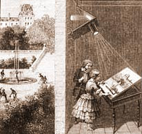
Around the mid-17th century, paintings began to appear depicting images that possessed stunning optical accuracy. This is the same time period in which the lens- and mirror-based camera obscura became known to artists, particularly the Dutch oil painters. The work of painter Jan Vermeer has been the subject of scholarly analysis demonstrating his use of the camera obscura as a tool in the creation of his depictions of everyday life.
Vermeer’s work exhibits a dramatically accurate representation of light and color. The apparent size differences of objects relative to the viewer are consistent with an optically projected image. The optical effect of soft halation around brightly lit objects is present. To maintain a competitive edge, artists that employed the camera obscura were highly secretive of its use, leaving the public in awe of such painted realism.
Today’s camera obscura is the computer screen. A photograph can coexist effortlessly within Corel Painter’s art studio of brushes, the artist free to dip their paintbrush into a photograph. Just as the theory of perspective and the camera obscura before it, Painter is another technologically advanced tool of interest to artists. With each of these tools, an image of reality is presented as a starting point. The artist then develops the image with the touch of humanity.
The Artist is the Film.
Ever since artists have been drawing on flat surfaces, they have employed techniques to aid in their quest for realism. Prior to the Renaissance, most art was primarily employed to aid in the teachings of the Church to an illiterate population. Symbolism, rather than realism, was paramount to the artist and to his audience.
With the Renaissance came humanism and the flowering of the sciences. The Florentine architect and artisan-engineer Brunelleschi is credited with the invention of linear perspective. This mathematical system accurately describes the visual fact that the apparent size of an object decreases with increasing distance from the eye. The use of perspective enables the depiction of a three-dimensional scene on a two-dimensional surface.
Due to our visual sophistication, it is difficult for us to fathom the emotional impact of a three-dimensionally painted image upon a population unfamiliar with perspective representation. Its awe-inspiring, heightened realism provided artists with a powerful tool for visual communication. As the theory of perspective spread among artists, various mechanical perspective aids were created to assist in the transcription of reality to a two-dimensional surface.
Concurrent with the Renaissance was the development of scientific optics. Finely ground lenses were used to magnify the heavens as well as microscopic objects. One of these lenses was eventually fitted to the pinhole of a camera obscura, a technique which employed a darkened space, such as a room, to project an exterior scene upon a two-dimensional surface within the room’s interior. This was essentially a room-sized camera without film.

Around the mid-17th century, paintings began to appear depicting images that possessed stunning optical accuracy. This is the same time period in which the lens- and mirror-based camera obscura became known to artists, particularly the Dutch oil painters. The work of painter Jan Vermeer has been the subject of scholarly analysis demonstrating his use of the camera obscura as a tool in the creation of his depictions of everyday life.
Vermeer’s work exhibits a dramatically accurate representation of light and color. The apparent size differences of objects relative to the viewer are consistent with an optically projected image. The optical effect of soft halation around brightly lit objects is present. To maintain a competitive edge, artists that employed the camera obscura were highly secretive of its use, leaving the public in awe of such painted realism.
Today’s camera obscura is the computer screen. A photograph can coexist effortlessly within Corel Painter’s art studio of brushes, the artist free to dip their paintbrush into a photograph. Just as the theory of perspective and the camera obscura before it, Painter is another technologically advanced tool of interest to artists. With each of these tools, an image of reality is presented as a starting point. The artist then develops the image with the touch of humanity.
The Artist is the Film.

